Showing posts with label random. Show all posts

Thursday, 6 February 2014

KINETIC TYPE

Click here to view my latest attempt at using Flash. This didn't take as long as I thought that it would.
The website used is a saviour for showing off Flash (SWF) files, however, I have noticed that it does cause a bit of a lag making it stick.
The singer is the fantastic, Tori Fuson who also wrote this absolute tune. Be sure to follow her on Facebook by clicking on her name below. 


Wednesday, 5 February 2014

CAFFI CWTCH

I always try my best to support any local and independent shops that open up on the high street.
In Newport, there is a new cafe near the train station called, 'Caffi Cwtch' (Translates from Welsh to English as Cuddle Cafe).
Caffi Cwtch is perfect for me. It's a local coffee shop, they sell Welsh products and it's convenient. However, their design is not as impressive.
Caffi Cwtch's logo is simply a red background with their name in a very basic font (looks somewhat like Times New Roman). It doesn't stand out at all and it doesn't make itself look that appealing to new customers.

Logo
I quickly knocked up this design and I actually really like it. I decided to stick to the red theme (represents Wales) and to keep it simple and basic as obviously the owners of Caffi Cwtch would want it to be basic. The font used is probably one of my all time favourite fonts, it's called Stainy Personal Use only
I think this logo just screams individuality, sophistication and being unique.
I also did a copy in black and white to see what it looks like if it were to be actually used.

Poster/Leaflet 
As this is a local cafe in the heart of Newport, I wanted to include typical Newport humour into this design. I believe that appealing to the local audience and what they like will only be beneficial to the local cafe and its profits.
I think the posters/leaflets could even span out to be their own advertising campaign by capturing popular and local sayings and including the word 'cwtch' into it. I've actually seen birthday cards in a few shops in Cwmbran and Newport that focus on popular sayings/films and turning them into an inside Welsh joke, such as, "Cwtch me if you can."

I hope you all enjoy it!


Friday, 27 December 2013

HOW IMPORTANT IS A FONT? very.

Merry Christmas and Happy New Year to everyone reading this.
I decided to quickly show how important choosing the right font is. If you get the wrong font, you're in jeopardy of ruining your design.
Here are the visuals I've made to show you. (Click to make bigger)

The Comic Sans
Those two words that scare any graphic designer, 'Comic Sans'. You would be surprised to know how many times I have seen this font over the past month or two in the build up of Christmas.
I actually think, personal opinions on the font aside, this isn't too bad. It suits the target audience and looks somewhat ok. Naturally, it wouldn't be my first font to use.


The Helvetica
That one word every designer likes to hear, 'Helvetica'. Helvetica is a tricky and complicated font. Sometimes it works, sometimes it doesn't. It all depends on what you need it for. For this, it doesn't work at all. It's not a festive font and nor does it fit in with the colour scheme and design going on around it.


The Cast Iron
It's no secret that I like Circus Fonts. Circus fonts are just so versitile. They can be black and white, pink, orange... you name it. I decided to try the Cast Iron font for this quick mess around and I am pleased with the results.

So, how important is a font? Very important. Pick wisely and don't always stick to Helvetica. 

Tuesday, 9 July 2013

INFOGRAPHICS: INDOOR AIR POLLUTION

So as the regular readers are aware, I have moved to Wuxi, China to teach English for a year to gain experience and something to add to my C.V. Just because I've moved abroad, it doesn't mean that I have forgotten about design. I am currently working with an independent design company doing some volunteer work and have produced some beautiful infographics. Here is one that the company really liked. Beautiful, easy to understand and straight to the point! 
Hope you enjoy! 


Wednesday, 27 March 2013

PANTONE OVERLOAD

Ever wanted to remember your favourite Pantone colour but cant? With these handy new inventions its even easier to do so -


Saturday, 27 October 2012

MISC.

In the past month I have moved from the UK to China to teach. I live in a small (5 million people) city called, Wuxi near Shanghai.
Therefore, this has been the reason why I haven't posted for quite a while. I do intend to continue my regular posts with photography, graphics, arts, typography and any misc posts.
Here are some nice photos I've captured over the past few months.
Enjoy!


Sunday, 25 September 2011

STATS & FACTS


Was a bit bored earlier so decided to put some good fonts to use and did some infographics. Only took me about 20-30 mins so nothing too special or serious. I am aware it doesn't look great on the home page but just click the image so it can be seen in its original size!

Friday, 23 September 2011

''NEWPORT'S INSTITUTE OF MENTAL HEALTH''


EXHIBITION 
Friday I went to the launch of the 'Institute of Mental Health' exhibition in Newport, South Wales. I was really impressed with the work on show as half was fine and delicate (not my kind of thing) whilst the other half was more abstract and modern (just my thing!)
My favourite was the Fuerza Cristina Macri 2011 by Luke Pomphrey (the last two pictures). Anyone who comes here often would understand that this type of art is what I love - hence why I was enjoyed the exhibition so much!
I think from now on - I'm going to be going to more and more art and design galleries as they're great to get inspiration but also to see the range of work out there at the moment!


Thursday, 22 September 2011


WORK EXP.


HELLO JAPAN.
Regular visitors to the blog may know that I had some work experience lined up in an independent and small Japanese Magazine. For the past few months, the magazine and I have been talking about what they want//what they expect and also what I think I could bring to the company. You may have noticed I have done posts on Japanese photography and other Japanese related stuff - in which I did to help me get a feel to the Japanese styles. On the magazine's blog they updated their members area with a special shout out to me welcoming me to the team in Japanese. 
The text translates into a little intro I did on myself and a little extra that they wrote in welcoming me to the team! I am so happy to be working with them as everyone knows editorial design is my ideal place in terms of graphics.
Keep checking back for updates/samples of my work! 

Wednesday, 21 September 2011

MISC


This is a new section to my blog called 'MISC' in which I will upload pictures of stuff I have seen/found whilst in my day to day life. I have the biggest eye for detail and am always snapping away, which is why I decided to do this.
MISC is basically where I upload anything random/arty/or anything aethestically pleasing. I will probably aim to do it once a week/once every two weeks depending on what I have to share. 
Check out the first edition of MISC below!


CAITLIN THE PAINTER
The other day I was seeing my niece and saw this painting she drew. My niece is only 5 and to the people who come on the blog often, they will know that this style of art is right up my street. Its got a feel of Jean-Michel Basquiat to it (which I bloody love), but I like how  self explanatory it all is too. It looks like Caitlin was drawing a rainbow whilst it was raining - which explains the burst of colours! 


BECKY LEWIS
My mate Becky Lewis drew me a portrait of myself as part of my birthday present and this was the final outcome. I used to have a picture of myself in where Becky drew this picture from. Its uncanny and looks so amazing! I did a post about Becky a while ago because her pictures just seem to be spot on! 


SCENIC VIEWS
I was in the back garden the other night and was playing around with my iPhone camera and think a rain drop hit my camera lens and this was the final outcome. It looks like I have edited it on photoshop, but believe it or not - the lighting from the street lamps and the flash made this picture look professional and shows its great camera!


TRAFFIC JAM GRAFFITI 
Across Newport, South Wales you will find funny and amusing prints on some of the posts around the city. I was walking to the shop the other night and saw this one on one of the main roads in Newport and thought I needed to take a photo to share with you lot! I think theres someone going around spraying on a stencil - but I quite like it, it brings a bit of character to the stands and catches the eye!


&
 before I go - I just wanted to add that I will be posting on Sat/Sun this week fo sho because I'm going to Newport Art Gallery for the Mental Health Exhibition which I can't wait for! I'm planning on taking loads of photo's so do pop back and check!


Friday, 9 September 2011

DUTCH CLOGS AND BLOGS!


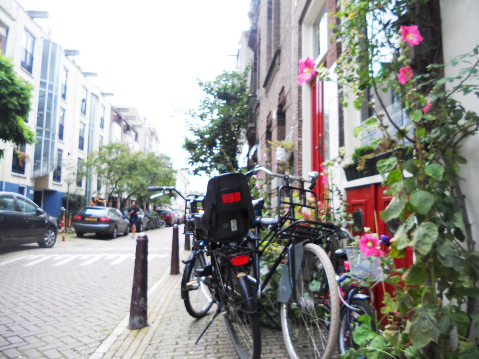
 I haven't gone to Holland - but my step sister did and she took some amazing snaps whilst she was out there.
In year 2 of uni, I did a presentation on the signage design in Schnipol Airport designed by Mijksenaar and asked my step sister to get me a few snaps of the signage in the airport.
She took some stunning snaps - not just of the airport but also Amsterdam itself.
Thought I would share the pictures she took with you guys because they're worth a little look!
Also the last picture is of Cardiff (South Wales) at night time. My camera broke on me and took pictures like this - a happy accident as I would call it.
Just a bit of random posting here, but enjoy!
Garuff!


Wednesday, 31 August 2011

ERODED FONTS


Due to the success and interest I have had since blogging about circus fonts, I decided to mention some eroded looking fonts. I have always been on the search for fonts like these, but find it hard to come across nice ones. A lot of eroded fonts can look cheap and have too much going on distracting the viewer away from the purpose of the text. 

These fonts below are a mixture of stylish, rough and 100% eroded. I hope you enjoy the quick layout I did, it's nothing special I know, but its always great to see what a font would look like when used. 

DOWNLOAD
GIZ 


Saturday, 13 August 2011

C.V.

I designed my C.V. a few months ago now whilst I was still in uni as part of a project. The photo really doesn't do it much justice (my camera lead has gone missing so had to take a photo using my iphone) but it's still alright. I didn't want to put many pictures of it up as its got quite a lot of personal details about myself but my initial idea was to do my C.V. based around the London Underground Map. I changed my idea to this and am quite pleased with it. Its colour coded for all the different achievements/employments/info about myself with some text coming off going into more detail.
Not the best picture, but enjoy! 


Sunday, 7 August 2011

HAPPY BIRTH - DAY.


Not my design, but saw it whilst searching for some new circus fonts and thought it was wicked! I might start doing stuff like this myself with different font and colours. 
I never really thought of using a circus font for a greetings card but I really think it works! I wish I did some of these when I still had the printers and card stock in uni, but give it a go! Looks easy and stylish enough!


We have MOVED! Visit the much improved, www.jelidesign.com for more of our designs and a regular blog post!


Saturday, 6 August 2011

VINTAGE SHOP.


 I was walking home from town today and walked past this vintage shop. I never seen it before I don't think and it just caught my eye. I don't think the photos give it much justice but it looked awesome! I'm not sure if it was a second hand shop but I think I might pop in and have a look when its next open.
The reason why I took photos of it was because the suitcase. My regular followers may have seen the blog post of when I got my giant suitcase for a uni project (which I didn't use after), but really loved the collage on the case. I never really thought about collaging magazine and poster covers on an old suitcase but I think it works!
Just a random blog post, but enjoy!


Monday, 18 July 2011

MY TOP 5 FONTS: #1 - MOD


Could you read it? I could. I have had a massive response to MOD. Some people saying its one of their favourite fonts, to others disagreeing completely saying its too bulky, cant understand it and just doesn't appeal to them. 
I personally love the MOD font, I agree that sometimes you can't really understand which letter is which - but I have always enjoyed bold and bulky fonts, so naturally I would defend this font.
For this, I wanted to show MOD in a series of different ways. I wanted to include black and white and a range of colours so that you can see what colours go with this font and which ones don't. Additionally I also included image and text (first two images) in which I incorporated a random image and the font together. I love doing this with MOD because its a bulky and bold type, not to mention trendy and modern - so it would naturally work together and create something beautiful. 
I personally think this type of font is best suited for editorial design such as magazines and brochures, but its already proved to be versatile enough by coping with a range of colours and a range of scenarios, so it would probably work and look pleasing if used for another area of graphics. 

(Click on the images to see in better detail) 


Friday, 15 July 2011

NEWPORT STREET ART?

I went to town (Newport, South Wales) today with my mate to look at phones and took my camera because I was taking photos of my nan's dog and had my camera with me whilst in town. I saw some vandalism/tatty shit on some of the walls in the high streets and took some pics. This kind of rough, edgy and ripped look is right up my street. If you look at my Basquiat stuff, its all about texture and vandalising something to get it to look out there!
Also, third picture down - Circus fonts are used again. Honestly, since I first blogged about it, I can't stop seeing it.
BTW, the girl is my mate - she's so photogenic!


Tuesday, 14 June 2011

MORE CIRCUS FONTS.

A lot of people have been interested in the post I did about circus fonts ages ago. I decided to find some more that I really like which are circus like. As you can see, I found some stunners!
Below the image is where you can download them


We have MOVED! Visit the much improved, www.jelidesign.com for more of our designs and a regular blog post! 

Saturday, 11 June 2011

STENCIL

I printed out 'garuff' on a piece of paper yesterday and just cut the lettering out and placed it on my kitchen table and the grass/cat in the back garden. I wasn't going to post it as it is silly and quick - but it looked alright when i took the photos, so i thought why not! Nice aren't they?