Showing posts with label typography. Show all posts

Saturday, 8 August 2015

JELI DESIGNS

It's been awfully quiet here at GARUFF. So quiet in fact, that we have moved.
Garuff has now moved to www.jelidesign.com
Please feel free to click on the above link to see how Garuff has progressed from amateur designer, to profesional with experiences in Asia, America and Europe.
The new website looks and feel truly Garuff, but with a twist. The website is simple, elegant and beautiful!
Additionally, we have a successful blog that features how we got to an end result.
Garuff has been an amazing time, and it's been great to view the previous posts over the years. We are still getting hits on here, but this will be our last post.

For the last time,
Love Garuff / Jeli

x


Wednesday, 19 February 2014

EBK

I have been working with a company in my hometown, Newport. I am enjoying it and I am most importantly, learning some more about design!
I have been give a project to create an EBK (ebook/ebrochure) for a local company. This local company is aiming to sell themselves and their products to other local companies.
One thing I would like to add is that since designing this, I have also been designing a magazine cover for a company in Shanghai. It never fails to amaze me how someone with little/no design knowledge insists on something that is going to look visually awful!
I quite like this EBK. There are some minor changes I would have liked to change - but in general, it's pretty good!
Enjoy!

Friday, 7 February 2014

KINETIC TYPE

I am currently reexploring my passion for type and flash. Today I have created another video but this time I have managed to upload it to YouTube.
I just want to say that when designing this video, the type was in sync with the song. However, when I exported this file to a .MOV, it seemed to have seriously lagged.
Try your best to ignore the lagging and focus on the beautiful type!
Xiexie / Thank you.


Thursday, 6 February 2014

KINETIC TYPE

Click here to view my latest attempt at using Flash. This didn't take as long as I thought that it would.
The website used is a saviour for showing off Flash (SWF) files, however, I have noticed that it does cause a bit of a lag making it stick.
The singer is the fantastic, Tori Fuson who also wrote this absolute tune. Be sure to follow her on Facebook by clicking on her name below. 


Wednesday, 5 February 2014

CAFFI CWTCH

I always try my best to support any local and independent shops that open up on the high street.
In Newport, there is a new cafe near the train station called, 'Caffi Cwtch' (Translates from Welsh to English as Cuddle Cafe).
Caffi Cwtch is perfect for me. It's a local coffee shop, they sell Welsh products and it's convenient. However, their design is not as impressive.
Caffi Cwtch's logo is simply a red background with their name in a very basic font (looks somewhat like Times New Roman). It doesn't stand out at all and it doesn't make itself look that appealing to new customers.

Logo
I quickly knocked up this design and I actually really like it. I decided to stick to the red theme (represents Wales) and to keep it simple and basic as obviously the owners of Caffi Cwtch would want it to be basic. The font used is probably one of my all time favourite fonts, it's called Stainy Personal Use only
I think this logo just screams individuality, sophistication and being unique.
I also did a copy in black and white to see what it looks like if it were to be actually used.

Poster/Leaflet 
As this is a local cafe in the heart of Newport, I wanted to include typical Newport humour into this design. I believe that appealing to the local audience and what they like will only be beneficial to the local cafe and its profits.
I think the posters/leaflets could even span out to be their own advertising campaign by capturing popular and local sayings and including the word 'cwtch' into it. I've actually seen birthday cards in a few shops in Cwmbran and Newport that focus on popular sayings/films and turning them into an inside Welsh joke, such as, "Cwtch me if you can."

I hope you all enjoy it!


Friday, 3 January 2014

TRUTH.

I have been on the prowl for some new fonts and have found some beautiful and trendy fonts.
My personal favourite is called, 'Stainy'. Stainy is the first and last font used on the collage below. I find that it looks quite 1950's America/ Coca-cola/ Pop art.
Enjoy the collection of my favourite fonts at the moment.


Fonts in order from top to bottom (Click to download) 


VIETNAM & SHANGHAI

I have redesigned the Shanghai ebook page. I haven't done any major changes except the colour scheme. I felt as if red symbolised China perfectly, however I don't think it looked as pleasing as it could have done.
I played around with the colour scheme and decided to stick to the main colour scheme which is a warming green. I will be using this colour throughout the ebook.
See the pictures below.


Also, I designed the page for Vietnam. It is pretty much the same as the Shanghai and the Malaysia pages with the same colour scheme and the same layout.
Of course, there will be some tweaks - but here is the page so far!


Wednesday, 1 January 2014

SHANGHAI EBOOK

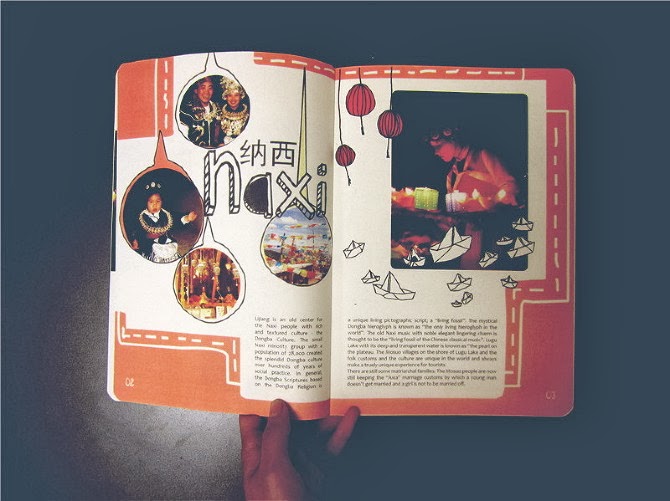
Continuing on with my very own ebook of the 2013, I have done a page which focuses on Shanghai.
Again, this is still not 100% complete. I normally have to leave some designing for a while and then come back to it and make some tweaks.
Here is what I've come up with so far.
Click to make bigger.


So I have included 4 different coloured lines on the image page. The reason on why I did this was to show the audience my overal opinions on Shanghai in a visual manner. The bars are colour coded and represents a different aspect of the city i.e. transportation, cleanliness...
Additionally, I have stuck with the same 3 fonts, code (light and bold), helvetica and prisma black. The colour scheme for this page is red, naturally. Red symbolizes good luck and wealth in Chinese culture. 
Enjoy! 

Saturday, 28 December 2013

TWO THOUSAND AND THIRTEEN.

2013 has been a super year for me. I've learnt so much, achieved so much and accomplished so much.
I have travelled to a few of my bucket list places which include, Malaysia, Thailand, China and Hong Kong.
To celebrate this great year, I am going to be creating a small and personal e-book in which showcases my year via the pictures I took.
Here is the front cover I designed last night. More to follow...
Click to make bigger and to view in HQ.


Friday, 27 December 2013

HOW IMPORTANT IS A FONT? very.

Merry Christmas and Happy New Year to everyone reading this.
I decided to quickly show how important choosing the right font is. If you get the wrong font, you're in jeopardy of ruining your design.
Here are the visuals I've made to show you. (Click to make bigger)

The Comic Sans
Those two words that scare any graphic designer, 'Comic Sans'. You would be surprised to know how many times I have seen this font over the past month or two in the build up of Christmas.
I actually think, personal opinions on the font aside, this isn't too bad. It suits the target audience and looks somewhat ok. Naturally, it wouldn't be my first font to use.


The Helvetica
That one word every designer likes to hear, 'Helvetica'. Helvetica is a tricky and complicated font. Sometimes it works, sometimes it doesn't. It all depends on what you need it for. For this, it doesn't work at all. It's not a festive font and nor does it fit in with the colour scheme and design going on around it.


The Cast Iron
It's no secret that I like Circus Fonts. Circus fonts are just so versitile. They can be black and white, pink, orange... you name it. I decided to try the Cast Iron font for this quick mess around and I am pleased with the results.

So, how important is a font? Very important. Pick wisely and don't always stick to Helvetica. 

EAST VS WEST - 'GOOD DESIGN'

I have just moved back to the UK after living in China for almost a year and a half.
Even though sometimes working 12 hour days for 6 days a week, I would still find time to include design into my life.
I lived near Shanghai so finding my fix of international design wasn't too much of a challenge.
I did however notice the huge differences between the east and the west in terms of what they both consider, 'good design'.
I feel as if in the west, especially the UK, white is alright. How often do we see successful pieces of art or design that is one big cluttered mess? Not since the early 90's. I feel as if in the UK, if you want to get noticed, be as minimal as possible when it comes to your designs, pick a good font and you're laughing.
In contrast, I noticed that China is toying between being minimal but also embracing full on clutterness and surprisingly, it works.
I have found some examples in which reflect the traditional modernness of the new and up and coming Chinese design field which can be viewed below.

Typical Chinese design examples


Typical British design examples

Review:
As you can see, the major differences between the two is; colour, space and font. 
I personally think that British design is one of the leaders in the world, and I am expecting the British design industry to take huge influence from Chinese design. As we all know, China is taking over the world, and that includes the design world, too.
I think it's only a matter of time before the western design world begins to mimik some of the way that the Chinese designers work by being more bold, making a statement and breaking the minimalistic rules.

Saturday, 7 January 2012

KEEP CALM & CARRY ON.

I havent posted for months I know, I have just been so busy with work and seeing my friends and family I haven't got round to it, but that doesn't mean I haven't done any graphics work.
I am a fan of Coldplay, but I'm more a fan of their latest album work, Xylo Myloto (see below). I love the fonts and I love the mash of colours and the entire collage feel to the album.
I have been casually playing around with their fonts and the use of colours and ended up with this, just a bit of experimenting with a new ray of fonts.


Wednesday, 31 August 2011

ERODED FONTS


Due to the success and interest I have had since blogging about circus fonts, I decided to mention some eroded looking fonts. I have always been on the search for fonts like these, but find it hard to come across nice ones. A lot of eroded fonts can look cheap and have too much going on distracting the viewer away from the purpose of the text. 

These fonts below are a mixture of stylish, rough and 100% eroded. I hope you enjoy the quick layout I did, it's nothing special I know, but its always great to see what a font would look like when used. 

DOWNLOAD
GIZ 


Sunday, 7 August 2011

HAPPY BIRTH - DAY.


Not my design, but saw it whilst searching for some new circus fonts and thought it was wicked! I might start doing stuff like this myself with different font and colours. 
I never really thought of using a circus font for a greetings card but I really think it works! I wish I did some of these when I still had the printers and card stock in uni, but give it a go! Looks easy and stylish enough!


We have MOVED! Visit the much improved, www.jelidesign.com for more of our designs and a regular blog post!


Monday, 18 July 2011

MY TOP 5 FONTS: #1 - MOD


Could you read it? I could. I have had a massive response to MOD. Some people saying its one of their favourite fonts, to others disagreeing completely saying its too bulky, cant understand it and just doesn't appeal to them. 
I personally love the MOD font, I agree that sometimes you can't really understand which letter is which - but I have always enjoyed bold and bulky fonts, so naturally I would defend this font.
For this, I wanted to show MOD in a series of different ways. I wanted to include black and white and a range of colours so that you can see what colours go with this font and which ones don't. Additionally I also included image and text (first two images) in which I incorporated a random image and the font together. I love doing this with MOD because its a bulky and bold type, not to mention trendy and modern - so it would naturally work together and create something beautiful. 
I personally think this type of font is best suited for editorial design such as magazines and brochures, but its already proved to be versatile enough by coping with a range of colours and a range of scenarios, so it would probably work and look pleasing if used for another area of graphics. 

(Click on the images to see in better detail) 


Friday, 15 July 2011

NEWPORT STREET ART?

I went to town (Newport, South Wales) today with my mate to look at phones and took my camera because I was taking photos of my nan's dog and had my camera with me whilst in town. I saw some vandalism/tatty shit on some of the walls in the high streets and took some pics. This kind of rough, edgy and ripped look is right up my street. If you look at my Basquiat stuff, its all about texture and vandalising something to get it to look out there!
Also, third picture down - Circus fonts are used again. Honestly, since I first blogged about it, I can't stop seeing it.
BTW, the girl is my mate - she's so photogenic!


Thursday, 14 July 2011

MY TOP 5 FONTS: INTRODUCTION

Over the next few weeks I will be designing spreadsheets on my top 5 favourite fonts. They are MOD, Say it Fat, Pincoya Black, Prisma and Geometry. I have found that every post I do on fonts gets a great reception, so I have decided to focus on my top 5 fonts by showing them in different colours, different words and in different scenarios.
Keep tuned for my first post on my top 5! 


We have MOVED! Visit the much improved, www.jelidesign.com for more of our designs and a regular blog post!


Thursday, 7 July 2011

IF YOU LOVE TYPOGRAPHY...

Then you'll love this. Its Rihanna, Kanye West and Kid Cudi's video for All of the lights. I was watching the music channels yesterday and saw this video and it caught my attention straight away!
Check it out!


BTW - takes a while for the typography to kick in - skip to just over a minute into the video! Also the cast iron font I have blogged loads about is used in it too!

Monday, 20 June 2011

CIRCUS FONTS (AGAIN)


 I am starting to get into my fonts, especially circus ones. The other day I did a post on more circus fonts that I like (click here to see) and had an email from someone who wanted to buy it. I printed it out twice on A3, one on recycled paper (which I love, love the texture and the off-white look), and another on a creamy kind of card stock. I didn't know which one to use so I just sent the two as they both look really nice!


We have MOVED! Visit the much improved, www.jelidesign.com for more of our designs and a regular blog post!


Tuesday, 14 June 2011

MORE CIRCUS FONTS.

A lot of people have been interested in the post I did about circus fonts ages ago. I decided to find some more that I really like which are circus like. As you can see, I found some stunners!
Below the image is where you can download them


We have MOVED! Visit the much improved, www.jelidesign.com for more of our designs and a regular blog post!