Showing posts with label editorial. Show all posts

Thursday, 20 February 2014

MAGAZINE

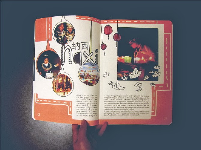
I have just finished designing for a magazine in Shanghai and found that the cultural differences are very obvious between what I would consider good design to what the Chinese may consider good design.
The first picture below is my answer to the brief.  I had less than a day to do this and I was quite happy with the overall outcome. However, the editors wanted some changes. The second image fits the brief to a T and naturally, they seemed to enjoy it.
I personally rather the first image, but hey ho!


Wednesday, 19 February 2014

EBK

I have been working with a company in my hometown, Newport. I am enjoying it and I am most importantly, learning some more about design!
I have been give a project to create an EBK (ebook/ebrochure) for a local company. This local company is aiming to sell themselves and their products to other local companies.
One thing I would like to add is that since designing this, I have also been designing a magazine cover for a company in Shanghai. It never fails to amaze me how someone with little/no design knowledge insists on something that is going to look visually awful!
I quite like this EBK. There are some minor changes I would have liked to change - but in general, it's pretty good!
Enjoy!

Friday, 27 December 2013

EAST VS WEST - 'GOOD DESIGN'

I have just moved back to the UK after living in China for almost a year and a half.
Even though sometimes working 12 hour days for 6 days a week, I would still find time to include design into my life.
I lived near Shanghai so finding my fix of international design wasn't too much of a challenge.
I did however notice the huge differences between the east and the west in terms of what they both consider, 'good design'.
I feel as if in the west, especially the UK, white is alright. How often do we see successful pieces of art or design that is one big cluttered mess? Not since the early 90's. I feel as if in the UK, if you want to get noticed, be as minimal as possible when it comes to your designs, pick a good font and you're laughing.
In contrast, I noticed that China is toying between being minimal but also embracing full on clutterness and surprisingly, it works.
I have found some examples in which reflect the traditional modernness of the new and up and coming Chinese design field which can be viewed below.

Typical Chinese design examples


Typical British design examples

Review:
As you can see, the major differences between the two is; colour, space and font. 
I personally think that British design is one of the leaders in the world, and I am expecting the British design industry to take huge influence from Chinese design. As we all know, China is taking over the world, and that includes the design world, too.
I think it's only a matter of time before the western design world begins to mimik some of the way that the Chinese designers work by being more bold, making a statement and breaking the minimalistic rules.

Thursday, 6 October 2011

EXTERNAL PROJECT

In Uni I handed in a batch of projects in this book. Here is the post I did a few months back showing this, click HERE to see it. I made this book by printing out the pages in order and then binding it together, I think it was the first book I ever made whilst including my work on it. Enjoy!

Wednesday, 5 October 2011

CARDIFF BAY ONLINE BROCHURE

I decided to put all the pages from my Cardiff Bay book together on an online publication. Click HERE to see the final outcome in print form. I did one in Welsh, will probably do a Welsh version of the online publication in the coming days! Hope you enjoy.

Tuesday, 4 October 2011

MAGAZINE COVER & CONTENT


Like you may or may not know, I am doing some work experience for a Japanese magazine. They asked me to do a piece on Britain (anything I liked) and decided to do it on The Great British Summer (?). I'm not too sure what I think of these and even if it makes much sense but my internet wasn't working over the weekend so just messed about with different styles and took some pictures in the fields by my house. 
Hope you enjoy! 


Thursday, 30 June 2011

EXTERNAL BOOKLET

For my external project hand in, I decided to put all the logos in a small A5, landscape booklet. The reason behind it was, I couldn't afford a portfolio (lol), but I'm glad I did as it gave me more experience in editorial and allowed me to be able to present not only my work but myself in a professional way. I don't know why it took me a while to post this, I handed it in about 4-5 months ago...but here it is!


Thursday, 26 May 2011

CARDIFF BAY

For my self initiated project, I decided to focus on advertising Cardiff Bay by making a brochure on the range of activities and things you can do whilst in the Bay. The photography used is mainly mine, but have used others found on the internet. Hope you enjoy!

COVERS


WELSH VERSION:


ENGLISH VERSION:


Here are the final versions of my brochure. I am pleased with how they look, they look professional and have been mistaken for actual brochures on the bay.
Also did a little shout out to my friend, Olivia...not from Bolton - but Newport! hahaha! Enjoy!