Showing posts with label design. Show all posts

Saturday, 8 August 2015

JELI DESIGNS

It's been awfully quiet here at GARUFF. So quiet in fact, that we have moved.
Garuff has now moved to www.jelidesign.com
Please feel free to click on the above link to see how Garuff has progressed from amateur designer, to profesional with experiences in Asia, America and Europe.
The new website looks and feel truly Garuff, but with a twist. The website is simple, elegant and beautiful!
Additionally, we have a successful blog that features how we got to an end result.
Garuff has been an amazing time, and it's been great to view the previous posts over the years. We are still getting hits on here, but this will be our last post.

For the last time,
Love Garuff / Jeli

x


Thursday, 20 February 2014

MAGAZINE

I have just finished designing for a magazine in Shanghai and found that the cultural differences are very obvious between what I would consider good design to what the Chinese may consider good design.
The first picture below is my answer to the brief.  I had less than a day to do this and I was quite happy with the overall outcome. However, the editors wanted some changes. The second image fits the brief to a T and naturally, they seemed to enjoy it.
I personally rather the first image, but hey ho!


Wednesday, 19 February 2014

EBK

I have been working with a company in my hometown, Newport. I am enjoying it and I am most importantly, learning some more about design!
I have been give a project to create an EBK (ebook/ebrochure) for a local company. This local company is aiming to sell themselves and their products to other local companies.
One thing I would like to add is that since designing this, I have also been designing a magazine cover for a company in Shanghai. It never fails to amaze me how someone with little/no design knowledge insists on something that is going to look visually awful!
I quite like this EBK. There are some minor changes I would have liked to change - but in general, it's pretty good!
Enjoy!

Friday, 27 December 2013

HOW IMPORTANT IS A FONT? very.

Merry Christmas and Happy New Year to everyone reading this.
I decided to quickly show how important choosing the right font is. If you get the wrong font, you're in jeopardy of ruining your design.
Here are the visuals I've made to show you. (Click to make bigger)

The Comic Sans
Those two words that scare any graphic designer, 'Comic Sans'. You would be surprised to know how many times I have seen this font over the past month or two in the build up of Christmas.
I actually think, personal opinions on the font aside, this isn't too bad. It suits the target audience and looks somewhat ok. Naturally, it wouldn't be my first font to use.


The Helvetica
That one word every designer likes to hear, 'Helvetica'. Helvetica is a tricky and complicated font. Sometimes it works, sometimes it doesn't. It all depends on what you need it for. For this, it doesn't work at all. It's not a festive font and nor does it fit in with the colour scheme and design going on around it.


The Cast Iron
It's no secret that I like Circus Fonts. Circus fonts are just so versitile. They can be black and white, pink, orange... you name it. I decided to try the Cast Iron font for this quick mess around and I am pleased with the results.

So, how important is a font? Very important. Pick wisely and don't always stick to Helvetica. 

EAST VS WEST - 'GOOD DESIGN'

I have just moved back to the UK after living in China for almost a year and a half.
Even though sometimes working 12 hour days for 6 days a week, I would still find time to include design into my life.
I lived near Shanghai so finding my fix of international design wasn't too much of a challenge.
I did however notice the huge differences between the east and the west in terms of what they both consider, 'good design'.
I feel as if in the west, especially the UK, white is alright. How often do we see successful pieces of art or design that is one big cluttered mess? Not since the early 90's. I feel as if in the UK, if you want to get noticed, be as minimal as possible when it comes to your designs, pick a good font and you're laughing.
In contrast, I noticed that China is toying between being minimal but also embracing full on clutterness and surprisingly, it works.
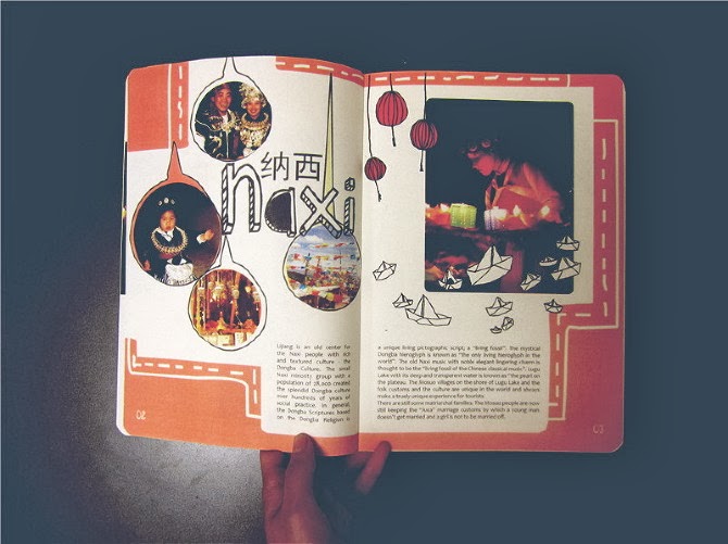
I have found some examples in which reflect the traditional modernness of the new and up and coming Chinese design field which can be viewed below.

Typical Chinese design examples


Typical British design examples

Review:
As you can see, the major differences between the two is; colour, space and font. 
I personally think that British design is one of the leaders in the world, and I am expecting the British design industry to take huge influence from Chinese design. As we all know, China is taking over the world, and that includes the design world, too.
I think it's only a matter of time before the western design world begins to mimik some of the way that the Chinese designers work by being more bold, making a statement and breaking the minimalistic rules.

MOCK UP.

This post is continuing on from the previous post below, about Indoor Air Pollution.
The brief stated they just wanted some info-graphics on the facts and figures on indoor air pollution and gave me full control over how I showed this.
I did two versions for this brief and allowed the company to pick whichever one they liked the most.
Here are the two versions I designed.
Please click on the images to view them in more detail.

Version 1


Version 2        


Review:
So I think the biggest difference here is the colour scheme. I personally enjoy seeing info-graphics that only contains one or two colours. I enjoy this because it gives you more control over what you want the audience to see first. By changing the gradient, opacity and the size, you are creating a statement using just a few basic colours. However, I do enjoy info-graphics that contain a lot of colour as it is more visually pleasing to the audience. Having said that, the designer should always be cautious when using a full range of colours as it can also detract and take away from the overall meaning. 
Result:
The company I designed this info-graphics for enjoyed both versions, but felt as if their brand was a modern and colourful one. The company decided to pick the second design which I agree suits their company more. 
Discuss:
One thing I have noticed since designing is, what the customer wants isn't always what the designer wants. Designers are told to stay away from 'Comic Sans' and to be cautious of too much colour from their very first day at university... but since doing more and more freelance work, the design's eventually need to reflect what the company wants, whether or not the designer approves or not is a different story. 

Tuesday, 9 July 2013

INFOGRAPHICS: INDOOR AIR POLLUTION

So as the regular readers are aware, I have moved to Wuxi, China to teach English for a year to gain experience and something to add to my C.V. Just because I've moved abroad, it doesn't mean that I have forgotten about design. I am currently working with an independent design company doing some volunteer work and have produced some beautiful infographics. Here is one that the company really liked. Beautiful, easy to understand and straight to the point! 
Hope you enjoy!